Thursday, 7 March 2013

Film schedule


 Filming Schedule
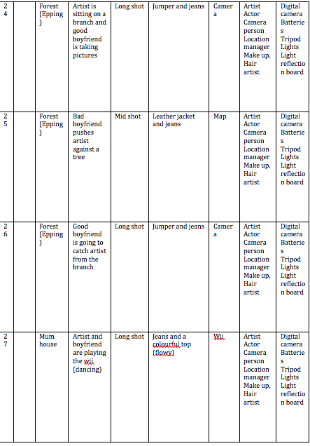
In order for filming to go as plan and to finish filming in time, a filming schedule is important as while filming you can check on the schedule to see what you need to film on that day. Also a filming schedule is important as you can plan out how long it will take to film certain scenes and what props you need during each scene. A filming schedule helps you be organised while filming as you can keep to the plan and you know what iconography and costume and make up the artist and actors will need for each scene. A filming schedule also helps as you can see what equipment you need for each scene too.


My group did stick to the filming schedule to some degree as we kept some of the shots, however as we decided to change the concept of the video we decided instead of having two shots on screen showing the good boyfriend and the bad boyfriend we decided that we would just show the actress with the bad boyfriend and then the actress will reject the apology - the actor giving the actress a rose - and move on with her life and at the end of the music video the actress meets a new boy who potentially could be her new boyfriend. Because of the change in the storyline we change several locations which we planned to film at for example; the car and the coffee shop. Also due to weather we decided to add in extra scenes of driving around in the snow as this could be a connotation that Northern Lights is going on a journey.


Wednesday, 6 March 2013

Storyboard

Below is the storyboard me and my group have created as we had to plan out what our music video would look like. We decided to follow our storyboard while filming in order to ensure that we film all the scenes we planned too. Later after filming we went back to our storyboard as we had to organise all our scenes in the correct order to ensure that the concept behind our music video was clear and made sense.


Meetings and discussions


Why are meeting and discussions important to carry out?
Meetings are important to carry out as it ensures that everyone is aware of the plan of the tasks that need to be undertaken. By attending meetings my group can discuss any ideas that we think we can include in our music video and we can plan how we want our music video to look and the concept behind it.

Did your group work well together?
As my group is just me and Meghan we worked well together as there was no conflict between us, as we both agreed on the concept behind our music video. However it was difficult to schedule the filming as we both had exams therefore it was difficult to meet up. Although we both found times which was suitable for both of us and then the filming went to plan.

Target audience feedback
My target audience feedback was useful as I was able to see how successful/unsuccessful me and my group had been with our music video. We were also able to see how we could have improved our music video - by making the storyline more clear and how our good use of icongraphy - such as the rose was effective by symbolising the actress and her life.


Thursday, 7 February 2013

Planning editing


Throughout my music video I plan on using a variety of editing skills. One of the editing skills I am planning to use is a fast forward effect, I will use it while the actress in my music video is tidying up after her boyfriend threw paper off of the table. I have chosen to use this edit here as it will convey to my audience that this is a regular routine which takes place for my artist, therefore she is use to fighting with her boyfriend and her boyfriend being violent towards her.
I will also use this editing technique - fast forward - while the camera shot is of a motorway and while there is a camera shot of driving. The effect here I would like to create is that the actress is going on a journey to make her life better. This editing technique is conventional to the electro-house genre as usually within this genre of music video there is a fast forward edit as the pace of the scene is parallel to the beat of the music which is usually fast and has an up-beat tempo.

Another edit I will use in my music video is reverse, I have decided to chose this edit as it can show how the actress has decided to leave her boyfriend and move on with her life - therefore taking the alternative route, which is the concept of my music video. This edit symbolises how she has turned back time and decided to stop feeling isolated and depressed in her relationship and has decided to leave her boyfriend and not forgive him - by accepting the rose - and moving on with her life. This will convey to my audience what Northern Lights - my artist - did during her previous experiences and how the actress is changing her regular routine and moving on from her boyfriend and rejecting his apology, therefore moving on with her life which will lead her to be happier. The effect from this editing technique I want to create is to show the audience how there are two alternatived routes in the actress' life and she decided to put her life back together and by doing so she broke up with her boyfriend. Also I plan to use this edit while the music is slow and the beat is slow therefore the visuals and music will be parallel, which is an electro-house genre code and convention.

I also plan to use a slow motion editing technique in my music video. I have decided to chose this editing method in order to make sure that the visuals and music are parallel - which follows Goodwins theory.This editing technique conveys to my audience how the artist feels at home and how she is scared of her own boyfriend within a domestic environment, as I plan to slow the pace of the scene while the actor is chasing the actress up the stairs. The effect I would hope to achieve here is to make the audience feel sympathetic towards the actress as she feels afraid within her own home, this challenges the electro-house genre conventions as usually within music videos in this genre the artist is having fun as they're usually performance based.

The effect I want to create within my music video is to portray how the artist is letting her audience 'behind closed doors' therefore this music video is personal to her. As my music video is narrative and concept based this is not conventional as the conventions of an electro-house music video is usually performanced based and includes dance.

Wednesday, 6 February 2013

Planning cinematography


I have planned to use a long shot image of the artist sitting on a chair, resting her face on her hand while looking down for the front cover of Northern Lights album.  This shot will show the artists body language  - which will be a connotation that the artist is depressed. Also by having a long shot the image will show the artists clothes and from this shot audience can look at the artists clothes and from this they will be able to feel they can relate to the artist, which will also make it easier for the artist and audience to build a relationship. This is not conventional as usually in a digipak the images are close up images for an electro-house digipak.

I have also decided to use a close up shot of the artist looking down with her hands covering her face for the digipak, as the connotation of this image can be that the artist has felt isolated and alone during the past. The image can reflect what some of the meanings behind Northern Lights lyrics will be. this is conventional as its a close up shot, however as we can not see the artists face, this goes against the conventions. This shot will help the artist and audience build a relationship as the audience will feel sympathetic towards the artist as she will look distressed this follows Adorno's theory that the audience forget about their personal needs and focus' on the artists feelings.

Another image I have planned to use for Northern Lights digipak is a mid shot image of the artist sitting on the stairs behind railings. This image will convey to the audience that the artist -  Northern Lights - has felt isolated and trapped. Also by having a mid shot the audience will be able to see the artists facial expression and the audience can feel sympathy towards the artist which will help the artist and audience build a relationship. This is conventional as the setting represents the main connotations of this image - the artist feels isolated and trapped.

I also have planned to use a mid shot of the artist sitting on the stairs while looking up into the light for an image in the digipak. This image will convey to the audience that the artist is beginning to feel happy and is leaving her depressing past behind her as she is looking towards the light. This is not conventional as the artist is not looking directly at the camera, and usually most artists look into the camera in order to build a relationship with the audience. This can help the artist and audience build a relationship as the audience may gain inspiration from Northern Lights and look towards the lights so that their lifes can be as good as Northern Lights.

Another image I have planned to take is a mid shot of the artist sitting on stairs and looking down at her lap, for the front cover. I have decided that this image should be on the front cover as the audience can feel sympathy towards the artist - Northern Lights - as the artist is looking down. Also during this shot the artist will wear black clothes and a colourful top, the connotation of the black clothes is that the artist may have a tough exterior however her inferior is colourful and bright which relates back to how Northern Lights is unique.

I plan to use close up shots of the actress looking directly at the camera crying, by doing so the audience will feel sympathetic towards the actress as they feel they can build a relationship with her. I also plan to use a close up shot of the actress doing her make up - the audience will feel that the artist is building a relationship with her as by making the actress look directly at the camera the audience will feel that Northern Lights is showing them how her life was like before and how down to earth and normal she is as shes doing her make up instead of being represented as looking perfect like other celebrities.

I plan to include long shots of the actress walking through a field - this will symbolise how the actress feels alone, which will help the audience and artist build a relationship as the audience are able to see that the actress portraying Northern Lights as how she was before she became famous felt alone and isolated therefore the audience can feel sympathetic towards her which will help their relationship build. Also I plan to include a long shot of the actress walking through westfields this will help Northern Lights and her audience build a relationship as they will see that the actress portraying as Northern Lights does normal things like shop in a shopping center which shows that Northern Lights is down to earth and does not follow the stereotypes of a celebrity therefore the audience will feel they're able to relate to the artist and actress in the music video.

Sunday, 6 January 2013

Planning location


Location: Meghan's house
My group has decided to choose Meghans house in the music video during the scenes the actress and actor are in their home it will help portray the concept of the music video and show what happens behind closed doors. Also by having it in Meghans house it conveys a message that the artist is letting her audience in her personal life as the audience will be able to see the artists previous domestic life - as the actress will be portraying what Northern Lights life was like before she became famous.
Action: 
In the shots that my group will film we will show the artist with her bad boyfriend - and the violent side of her boyfriend and how they argue often and how she feels isolated and trapped and how she felt afraid in her own home. 
Limitations:
The location limits what my group can do as we can not damage anything in Meghans house, therefore when we break the glass we will have to make sure about the health and safety risks and that all crew are safe.
Weather:
As we are filming indoor at Meghan's house the weather will not affect our filming.
This location is not conventional to electro-house genre as usually within an electro-house music video the location is in a club as usually electro-house music videos are performance based therefore there is dancing. However as my music video is narrative based we are not having dancing as we want to tell a story throughout out music video.

Location: Forest
Me and my group decided to use the forest as one of our locations to reflect our actress personality that she is a calm person. Also as the song is electro-house (up-beat and lively) and a forest is calm and picturesque the setting will be a complete contrast to the song which relates back to the concept behind the music video.
Action:
In the shots at the forest we will film how the actress is alone as her bad boyfriend does not spend any time with her, these scenes will reflect her feelings. 
Limitations:
The location limits what we can do as anyone within the public can go to the forest therefore we may have to wait or stop filming in order for other people to not be in the scenes.
Weather:
As it may rain this could affect our filming therefore our backup plan is to film this scene another time and instead film a scene indoors were the weather can not affect our filming.

Location: Westfields
My and my group have decided to choose this location as it a popular area where lots of people go therefore we can convey a message that are artist either walks with the crowd as she is the same as everyone else, or she walks against the crowd as she is an individual.
Action:
In the shots that we film our artist will be walking with the crowd and in another shot the artist will walk away from the crowd.
Limitations:
The location once again limits what we can do as the public will be at Westfields therefore while filming we need to make sure no one from the public is looking at the camera or this will make the shot low in versimilitude. 
Weather:
The weather can affect our filming if it rains therefore me and my group's back up plan is to wait for the weather to stop raining or reschedule and film another day.

Location: Plum Hill
Me and my group decided to choose this location as there is a clear view of London, which is a contrast to the hill which is quiet. This then reflects back to the concept behind the music video, where there are two alternatives in the actress life.
Action:
In the shots filmed at this location, the actress will accept the rose stay with the bad boyfriend. In another shot the actress will reject the rose and leave the bad boyfriend.
Limitations:
This location only limits what we can film as anyone from the public can walk through our scene while filming therefore we need to be careful when we film.
Weather:
As the weather could affect our filming if it rains, my groups back up plan is to reschedule and film a scene indoors instead.

All the locations we plan to film at are not conventional to the electro-house/dance genre as usually within an electro-house/dance music video the location is set at a club. However as our music video is concept based and we decided to challenge the genre conventions, the locations we have chosen make our music video higher in verisimilitude.

Wednesday, 19 December 2012

Photo shoot

Photoshoot

A photo shoot for our advert and digipak was essential as we had to make sure we took the correct photos to appear on our artists advert and digipak in order to show that within this album our artist will be opening up to her audience and telling her audience her life story. We needed our magazine advert to show our artist as a normal person who her target audience (teenagers to young adults) can relate too.  During the photo shoot we decided that we wanted our artists body language to be relaxed but open to show her target audience that within this album Northern Lights is going to tell her audience the truth about her life, therefore this is a personal album. We also decided that we wanted our artist to look directly at the camera to show her audience that she is building a relationship with them.


I have decided not to use this image as the front of the album as the setting in the photo is irrelevant. I think that the main focus should be on the artist on the cover and not the atmosphere around the artist. I decided to edit this photo to black and white as these colours together are a connotation of love and hate, this is what Northern Lights album is about. As the artist was not centre of attention I decided to blur the edges so that the focus is on the artist.


I have decided that I am not going to use this image for the digipak or the album cover as I think this image does not look professional, as on the right side of the frame there are unnecessary object e.g. the banister which are not relevant to the picture. Also the artist looks too depressed in this picture which does not relate to how we want the artist to be portrayed for this album.


I have decided that I am going to use this photo for my digipak as the railings on the staircase show that the artist - Northern Lights - feels isolated and trapped in. This relates back to the concept behind the song - Spectrum (Say my name) as in the music video one side of the artist will feel isolated and trapped. Also as there is low key lighting in this photo this is a reflection of the artists feelings. This image is not conventional to the dance genre as its not bright and colourful, however my group has decided to challenge the dance/electro-house genre.


This is the original photo of the front cover of the album. I decided to use photoshop to edit the photo and crop out the banister and the right side of the frame as this is unnecessary in the image, and takes the focus away from the artist as she is not positioned in the centre of the frame. I decided to use this photo in the digipak to show the audience that the artist is moving forward in her life. As the artist is looking up into the light this shows that she wants to lead a happy life. The connotation of this image shows that the artist is going to be happy, and she is innocent as she is looking up to heaven. Once I had edited this picture, the image followed the conventions of dance as it was bright and colourful.


This is one of the original photo's we shoot, without any edit. We decided to take this picture as we wanted the audience to feel empathy towards the artist - Northern Lights. Also the artist is wearing a leather jacket and black trousers, this is a connotation that the artist has a hard exterior on the outside. However as the artist is wearing a colourful top underneath the leather jacket this is a connotation that on the inside Northern Lights is nice and has a relaxed personality. I have decided to put this image on the front cover of the album as it shows the audience in a relaxed posture in a comfortable environment (her house) this is a connotation to show that the artist is comfortable with releasing this album and she is letting her audience into her personal life. This image is conventional to the dance genre as the clothes follow the dance codes and conventions, also as the clothes are similiar and not a brand this helps the audience feel they can relate to the artist.

Friday, 14 December 2012

Digipak reflection


Digipak reflection
After looking back at my digipak I think that it is not conventional to my genre - electro house as it challenges the music genre is the colours are dull and boring. An electro-house digipak will be bright and colourful however this digipak is boring as the colours as black, red and blue. Although the colour red brightens the digipak, the connotation of this colour are; danger and sex. This is not the representation of Northern Lights as her representation is innocents, so that her target audience can relate to her and so that she is a good role model. The colour black's connotation is prestigious and formality. However Northern Lights is a relatable artist therefore we want her to be represented as a normal girl who people feel they can relate too. The images are not following the electro-house genre as the flowers follow the the pop genre as this genre is usually for young children. As electro-house is usually listened to by teenagers to young adults, flowers do not follow the genre conventions. On the front cover of the digipak the typography is at the top in the center and the bottom at the right side of the frame, as the typography is in red bold font this stands out to the audience. Also on the back cover and the 'thank you' cover the typography is also red therefore it stands out to the audience.
I think my target audience - teenagers to young adults - will be able to build a relationship with my artist - Northern Lights. As my artist is portrayed as a normal down to earth girl who likes to express herself through her music. Also because the album is all about Northern Lights personal experiences and her private life I think her target audience will be able to build a relationship with her as the will feel they can relate to her.

My draft digipak
I decided to put the single name at the top left side of the frame so that it grabs the audience's attention. I then decided to put the artists name at the bottom right side of the frame to spread the typography out. Also I decided to have the background colour black so that the typography and images stand out from the advert. The choice of the image of the flowers is not conventional to electro-house as flowers is usually a pop genre convention. Also the colours on the digipak; red, blue and green are dark which does not follow the electro-house genre, Usually on an electro house digipak the colours are bright and colourful. To improve this digipak so that it follows the electro-house music genre I can put the typography in the centre of the screen so that its clear to the audience the artists name and the song title.


I decided to put the artists name at the top in the centre of the CD and the song title at the bottom of the frame in a smaller font. I also decided to put flowers on the CD so that the CD cover is not plain and boring as this is not the electro-house music genre. Although flowers are usually on a pop genre therefore the images on this CD cover is not conventional to electro-house. My choice to put a spray effect behind the artists name was to make the CD cover different and creative. To improve this slide I could make the CD a brighter colour and the typography a different colour as red is a connotation for sex, and Northern Lights is innocent and pure therefore the typography could be white or cream. Also I could change the design and instead have an image which has a connotation which relates to Northern Lights or is conventional to the electro-house genre.


I decided to put the title of this slide at the top in the center of the slide so that the audience are aware of what the slide is about. I then decided to put the names of everyone on the left side of the frame and a design on the right side so that this slide did not look boring. My choice to put the font is red was so that the connotation shows the audience that the names are important. I also decided to have blue flowers as on each slide there are flowers. If I could change anything I could change the colours of the font and design as the colour red is a connotation of danger and the names of this slide are not dangerous therefore the colour is making it unclear to the audience about how important the names are on this slide.


My choice to have a flower in the background was because I thought that the slide would be plain, however flowers are not conventional to the electro-house genre, as flowers are more of a pop genre convention. I also decided to put the producers names in the top right side of the frame as the audience were aware of the producers however my decision to position the songs of the album in larger font on the left side of the frame was because I thought that the songs were more important for the audience to see. The red colour of the font is a connotation of anger or danger, however Northern Lights representation is innocent, pure and she is a peaceful artist - so if I could change anything I would make the font a different colour so that the connotations of 
that colour relates back to the artist. I also put Island records logo in the left corner of the frame at the bottom so that the audience are aware of the record label Northern Lights is signed to.


This draft will assist me when creating my second digipak as I will try to make the second digipak more conventional to the electro-house genre. I will make my second digipak more colourful and bright and I will use photoshop to make a design which will make my digipak more effective for showing that the genre of Northern Lights slbum is electro-house.


My Final digipak
I think my second digipak is conventional to my genre - electro-house - as the colours are bright and colourful, in comparison with my draft digipak where the colours were dull and boring. Also the colours used for the typography; blue, green and purple relate back to the artists name - Northern Lights - and the design on each slide; green, pink and purple are in the spectrum which also relates back to the song title. I also have most typography and images in the centre of the frame as it makes the audience aware of what the main focus is on each slide.


I decided to position the artists name at the top of the frame as this makes the audience aware of the artist, I also chose to make the colour of the artists name in green as it relates back to the colours of the northern lights. This is conventional to the electro-house music genre as the artists name is usually at the top of the frame. I then decided to put the song title in the centre at the bottom of the frame in purple font as it stands out for the audience to show the audience what the song is called, also this colour relates back to the colours of the spectrum. My choice to position the artists image on the left side of the frame was because I thought by placing the image here the audience are aware of the artist and by placing the comments about the album on the right side of the frame this shows the audience how good the album is. This is also conventional to the electro-house genre as an image of the artist is usually in the centre of the frame so that the audience are aware of the artist. The design in the bottom left hand side of the frame is different compared to the flower as I decided this design relates back to how Northern Lights is unique and different from everyone as the design is spread out.

I decided to position the artist name at the top in the centre of the frame as this once again grabs the audiences attention and makes it clear who the artist is. I then decided to position the title of the song across the bottom in the centre of the frame as this spreads the typography out. The colour of the CD is pink, I chose this colour as it is brighter compared to the dark blue CD on my draft digipak. This is conventional to my music genre as digipaks within the electro-house music genre are usually bright and colourful. I also decided to have a pink CD as this is a connotation of femininity - which relates back to Northern Lights and how she is feminine. I chose to make the typography white as this is a connotation of innocents and purity which relates back to Northern Lights, this is conventional to the electro-house music genre as the colour white is usually on an electro-house digipak. My decision to put the same design which is on the frame cover was because it once again represents how Northern Lights is and individual from everyone else.


I decided to put the title of the slide at the top in the centre of the frame as it shows the audience straight away what this slide is about. I then chose to position the typography in the centre of the frame so that its clear and makes the audience aware of all the names, this not conventional to my music genre as the names are usually at the bottom of the frame. I decided to put the design in the background of the frame as it relates to the audience, a design on this slide is conventional to this music genre as it makes this slide less boring and more colourful. The blue and green colours of the design relate back to the artists name - Northern Lights - as the colours of the Northern Lights are green and blue.


I decided to position the titles of the songs in the center of the frame as it grabs the audiences attention straight away. I also decided to make the typography white as the connotations of white is pure which relates back to Northern Lights as her music is truthful as its personal experiences from her life. I positioned the Islands logo in the left at the bottom of the frame to make it clear to the audience the record label that Northern Lights is signed too. My choice to put the producers names at the bottom of the frame was because I thought that their names should not be at the top like on the draft digipak as its not conventional to the music genre - electro house. I once again put the design on the background of this slide to make the slide more colourful, therefore this is conventional to the electro - house genre.


In order to decide which digipak me and my group will use as our final digipak, I will share my production - my digipak - to my group and then we will all decide which digipak will suit Northern Lights and will cater to Northern Lights target audience and the electro-house genre.

My group have decided to use Meghans digipak as our final digipak as its more conventional to the electro-house genre as the colours used are more subtle which is a convention of the electro-house genre. Also we decided to use Meghans digipak as the style of the digipak is similar to our final magazine advert, therefore when Northern Lights target audience see either the magazine advert or the digipak this design on both productions will symbolise Northern Lights.